Designers use the rule of three in all the design elements as it helps to keep the magazine well structured. If the magazine designer uses more than three colours or three different fonts, the magazine becomes overwhelming and it almost starts to loose the theme it tries to control like in the Greenday Rocksound Cover. The cover uses too many shades of green which makes the colour all over the place. The text font also alternates too much as the consumer is unable to focus on certain parts of the magazine systematically.
 |
| Issue June 2009, ROCKSOUND cover, Greenday, left-to-right (Mike Dirnt, Billie Joe Armstrong, Tré Cool) |
There are four convention layouts:
Typefaces/fonts help to make the magazine stand out as well as go along with the theme of the front cover. There are two types of fonts which are Serif and Sans Serif font.
Serif fonts are clear fonts which allow the individuality of letters. Serif fonts have sharp straight edges. In other words, the words are not joint up and are easier to read. Serif fonts are often used for formal letters or essays.

The cover with 30 Seconds to Mars follows the colour scheme:
- The 'T' shape: Which has the consumer read the top of the magazine before looking down the middle of the magazine.
- The 'C' Shape: This has the consumer curve their view from the top of the magazine to the bottom opposite following a 'C' shape.
- The forward 'Z' shape: This one is easier as it has the viewer glance from left-to-right at the top going down diagonally and then left-to-right at the bottom.
- The backward 'Z' shape: This is the same as the forward 'Z' shape except the consumer goes right-to-left at the top and bottom.
Typefaces/fonts help to make the magazine stand out as well as go along with the theme of the front cover. There are two types of fonts which are Serif and Sans Serif font.
Serif fonts are clear fonts which allow the individuality of letters. Serif fonts have sharp straight edges. In other words, the words are not joint up and are easier to read. Serif fonts are often used for formal letters or essays.

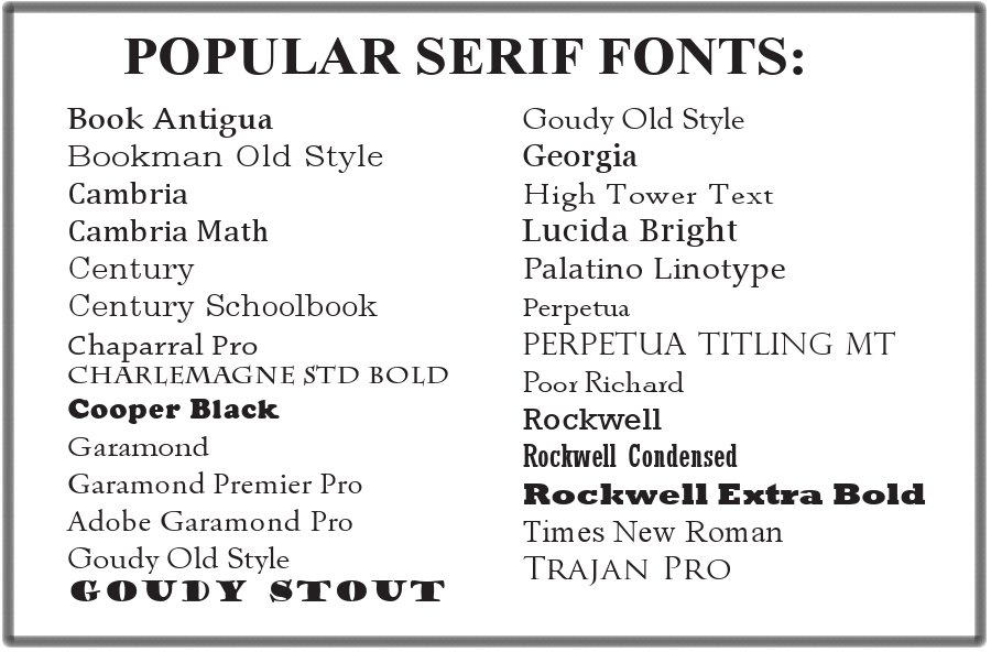
These are a few examples of Serif fonts which all have a sense of smartness as well as efficiency. Serif fonts are quite masculine in that they are straight and blunt.
Sans Serif fonts differ from Serif fonts for they join up the letters to make the writing fancy and beautiful. Sans serif have curved edges. Sans Serif fonts are often used for invitations or hand written notes.
These are a few examples of San Serif fonts which all are fancier. Sans serif fonts are often feminine due to their curved edge.
Colour schemes vary from magazine to magazine as the colours chosen, are often related to the anchor image. Print media selects colours to go in line with the theme of the image and the specifically follow the rule of 3.
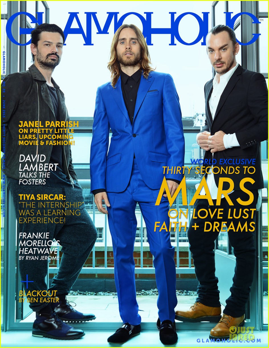 |
| Issue June 2013, Glamaholic cover, Thirty Seconds to Mars, left-to-right (Tomo Milicevic, Jared Leto, Shannon Leto) |
- Masthead is the same colour as Jared Leto's suit
- Yellow-ish plugs are similar colours to Shannon Leto's shoes
- White plugs are the same colours as Shannon Leto's shirt
After researching for ideas for my magazine I found that:
After researching for ideas for my magazine I found that:
- Rock magazines follow the typical lay out conventions as it gives them more mobility on how to place content and in addition it allows the house style to flow
- Font sizes are normally San Serif because it is bold, exclamative and it captures the attention of the reader
- They follow the rule of three most of the time but the only time they do not use the rule of three is to show that a statement is being made or to get a certain message across.
I will use all of these findings and try to apply them to my magazine to help ensure that the magazine, I created will be authentic and replicant to other rock magazines.
No comments:
Post a Comment